
04 — Branding
Stationery &Print Identity
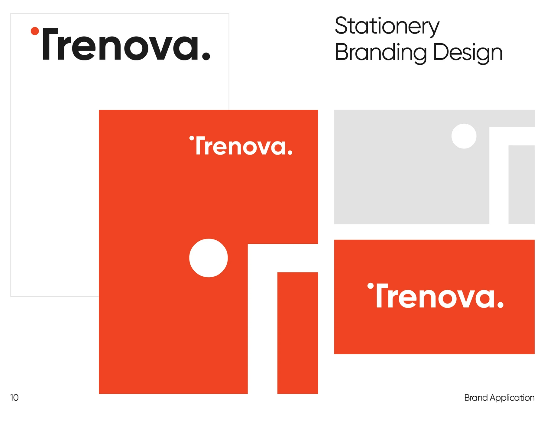
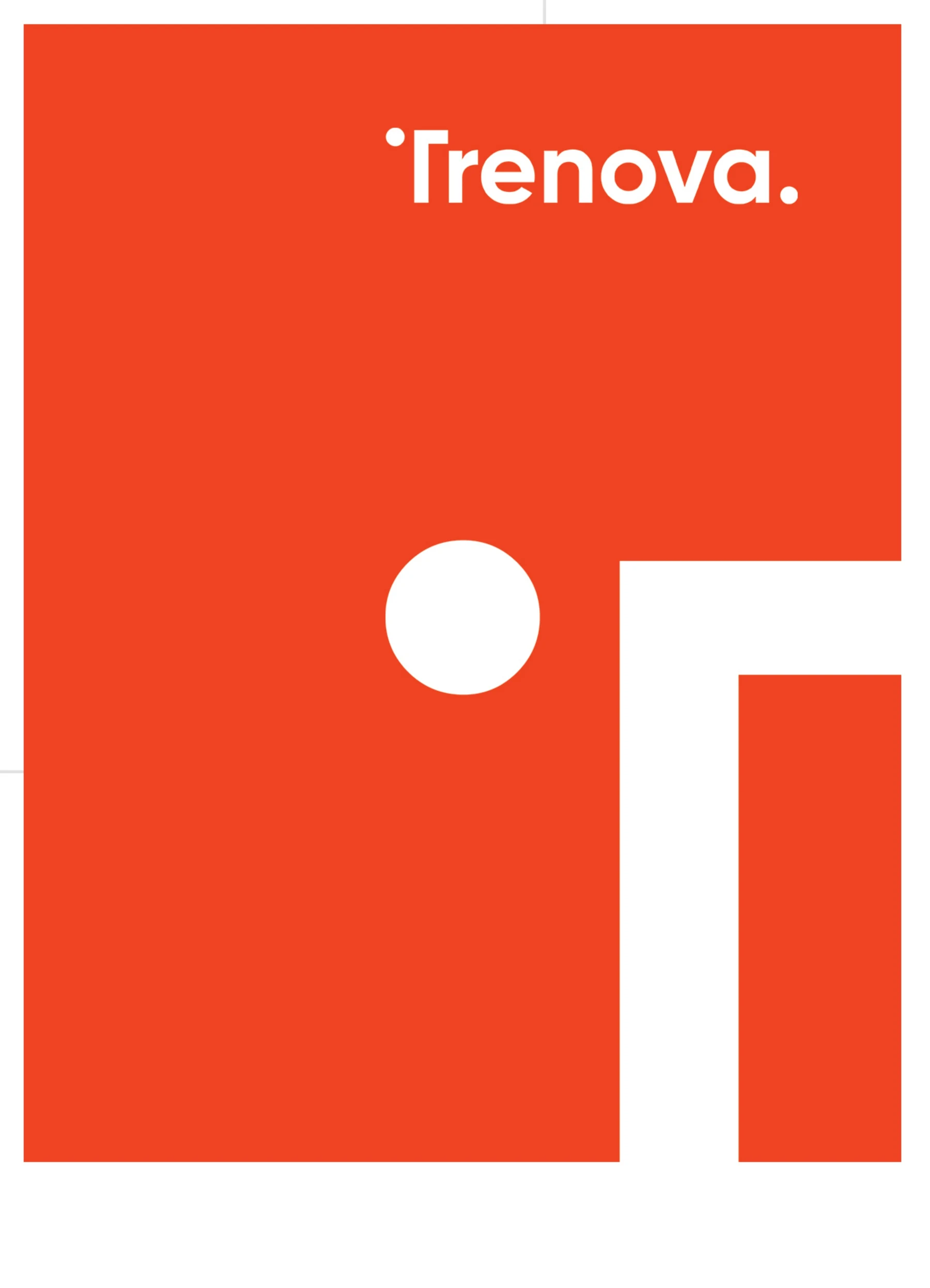
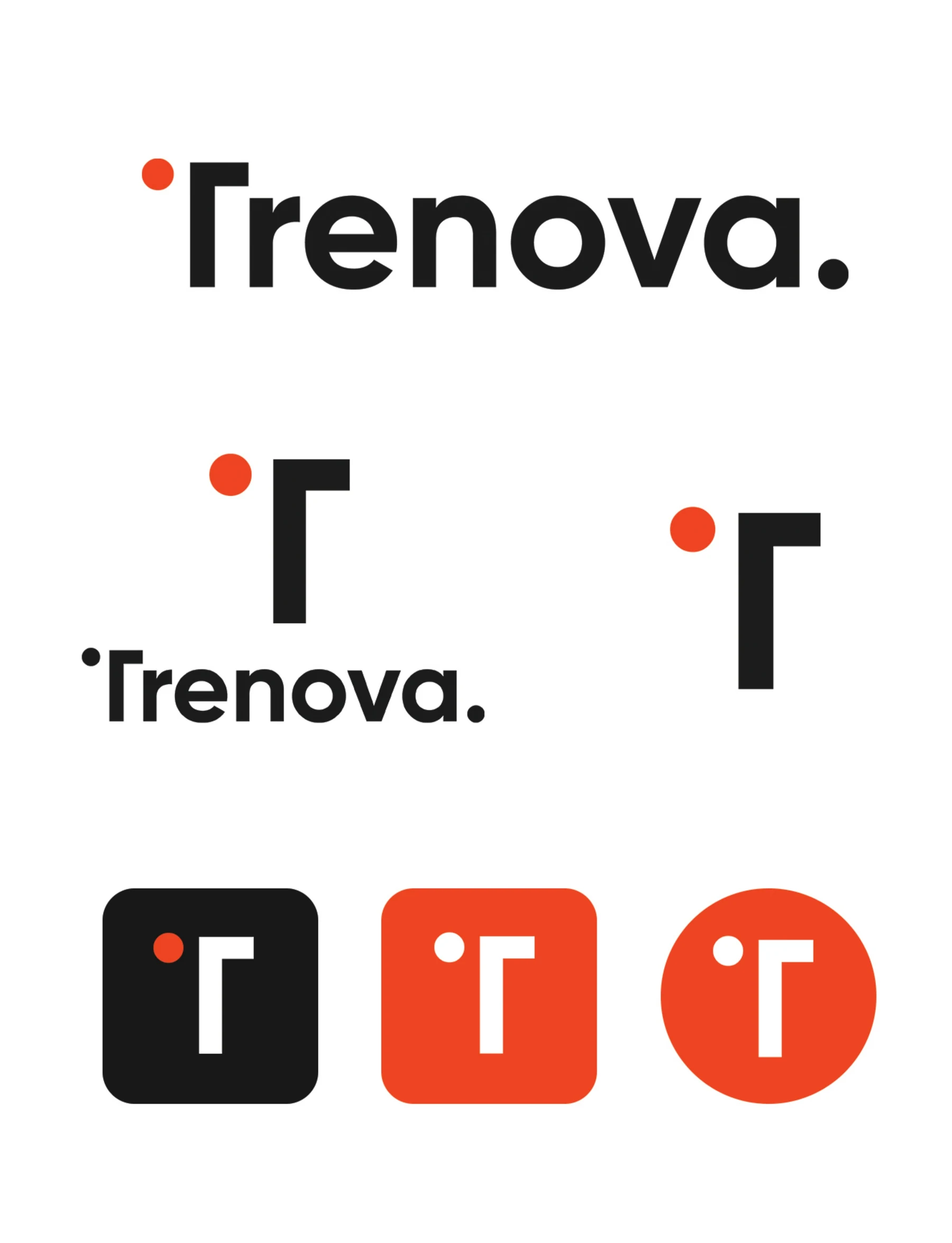
Letterhead, folders, and business cards that make the identity tangible — orange fields, white geometry, and the wordmark placed with strict clear space.
The Challenge
Give everyday business documents the same presence as campaign work, using nothing but the core brand elements.
Creative Direction
Asymmetric compositions of circles and right-angled bars — fragments of the T symbol — over confident planes of orange, white, and grey.

The Result
Print that introduces the brand before a word is spoken — precise, warm, and unmistakable.
Let’s makesome content.
Your story deserves more than just content. It deserves cinematic identity.
Start a Project
Reach out. Let’s create something unforgettable.