
09 — Branding
Logo &Symbol Program
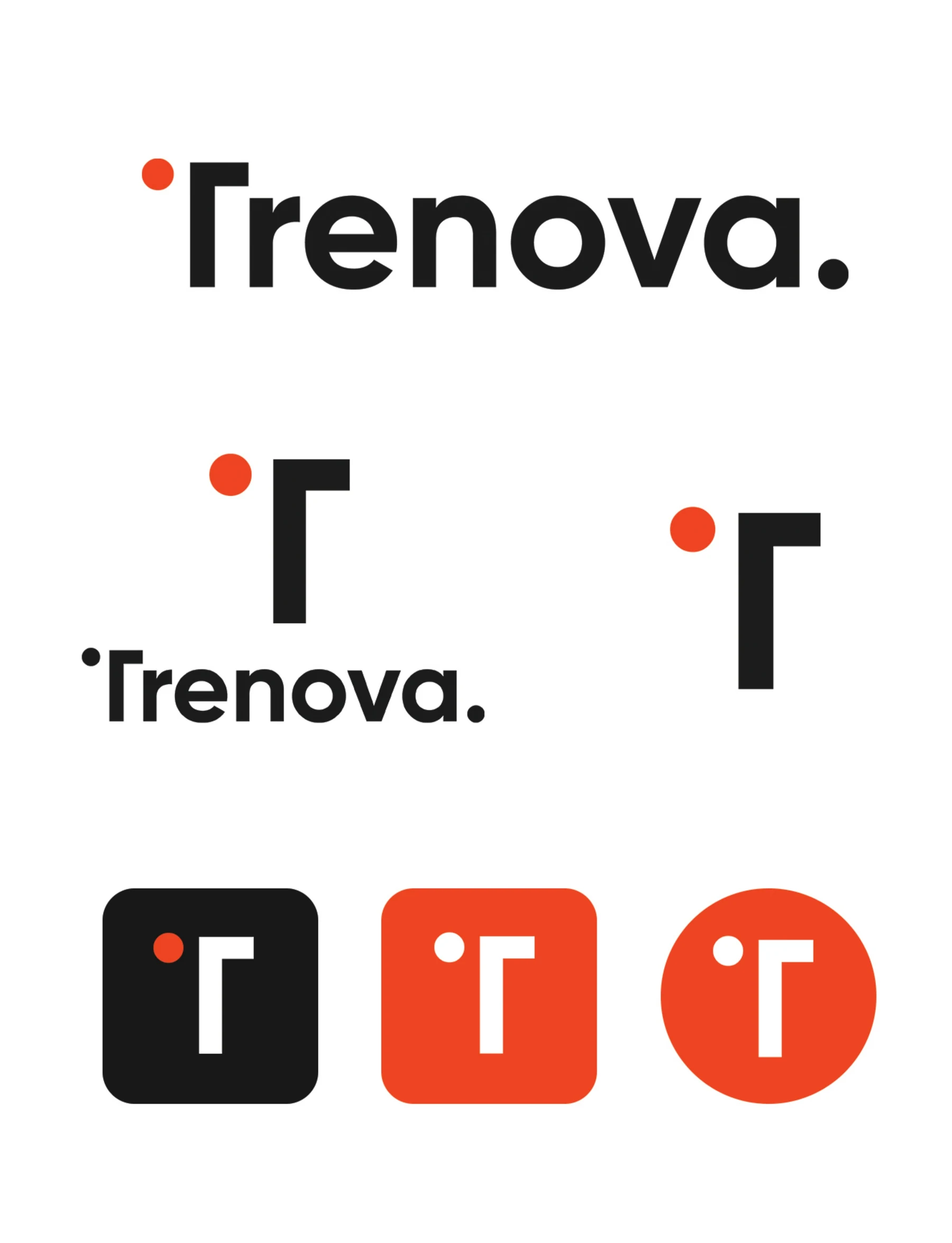
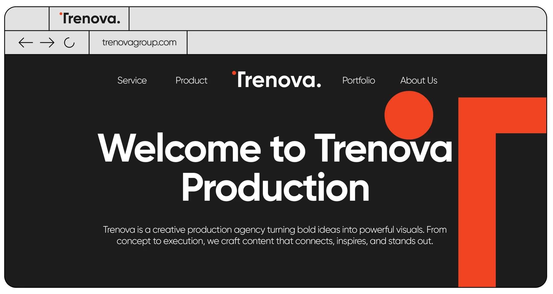
The mark itself: a wordmark whose T sheds its left arm for a floating orange dot, plus a standalone symbol scaled for app icons, favicons, and signage.
The Challenge
Design one mark that works from a 16-pixel favicon to a building façade, in positive and negative, on any brand color.
Creative Direction
Reduce, then reduce again — a dot and a right angle. Variations are systematized: full lockup, stacked lockup, and symbol-only icons in charcoal and orange.
The Result
A mark that is recognized before it is read — the dot alone is enough.
Let’s makesome content.
Your story deserves more than just content. It deserves cinematic identity.
Start a Project
Reach out. Let’s create something unforgettable.