
01 — Branding
Brand Identity System
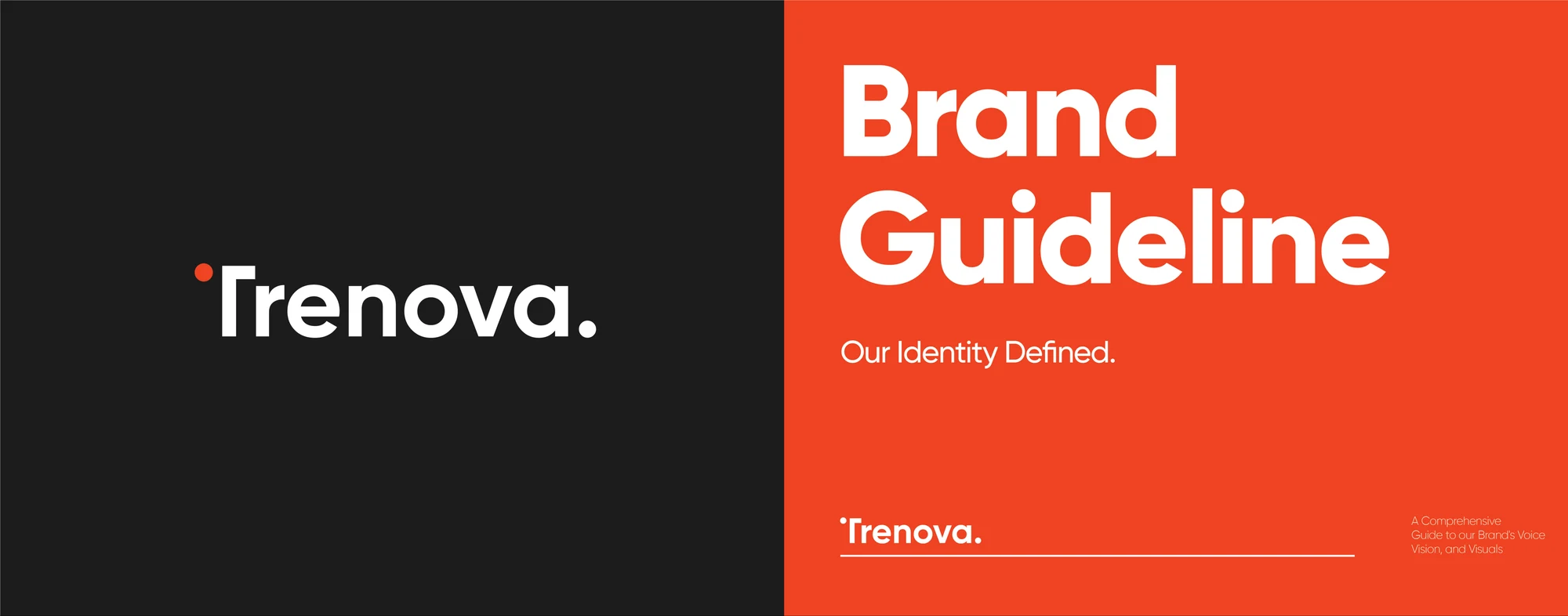
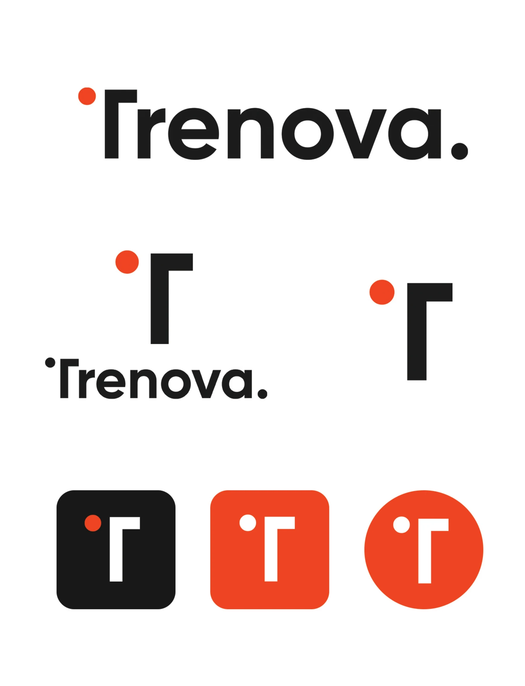
A complete identity program built around the Trenova wordmark, the standalone T symbol, and a palette of orange, charcoal, taupe, and soft sand — documented as a comprehensive guide to the brand’s voice, vision, and visuals.
The Challenge
Define one identity that stays bold at billboard scale and disciplined at favicon scale, with rules clear enough for any partner to apply without supervision.
Creative Direction
Geometric confidence. The T symbol’s floating orange dot becomes the recurring mark of the system, while strict clear-space rules, a two-typeface hierarchy, and a restrained palette keep every application unmistakably Trenova.


The Result
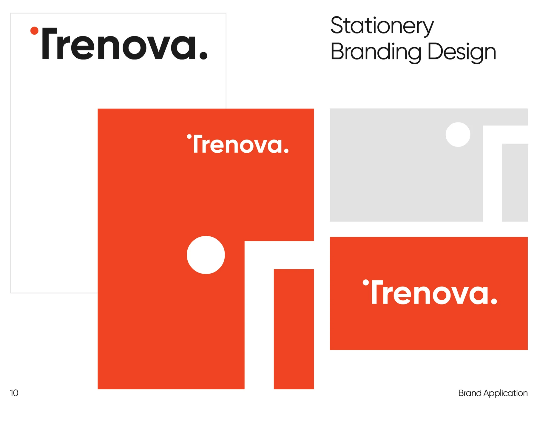
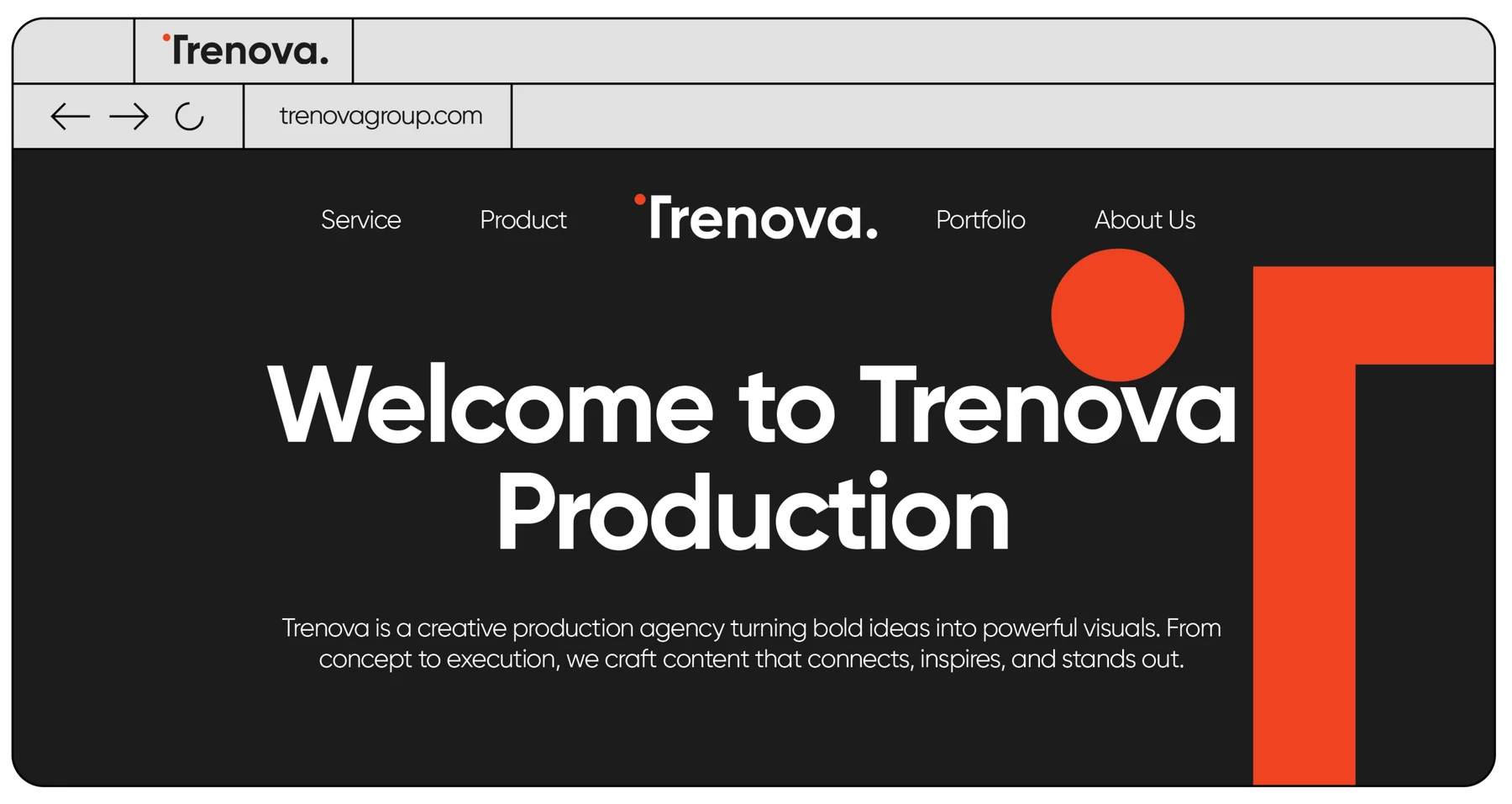
A single source of truth that keeps daring creativity and uncompromising quality consistent across print, digital, packaging, and apparel.
Let’s makesome content.
Your story deserves more than just content. It deserves cinematic identity.
Reach out. Let’s create something unforgettable.