
02 — Digital
Digital Branding &Web Experience
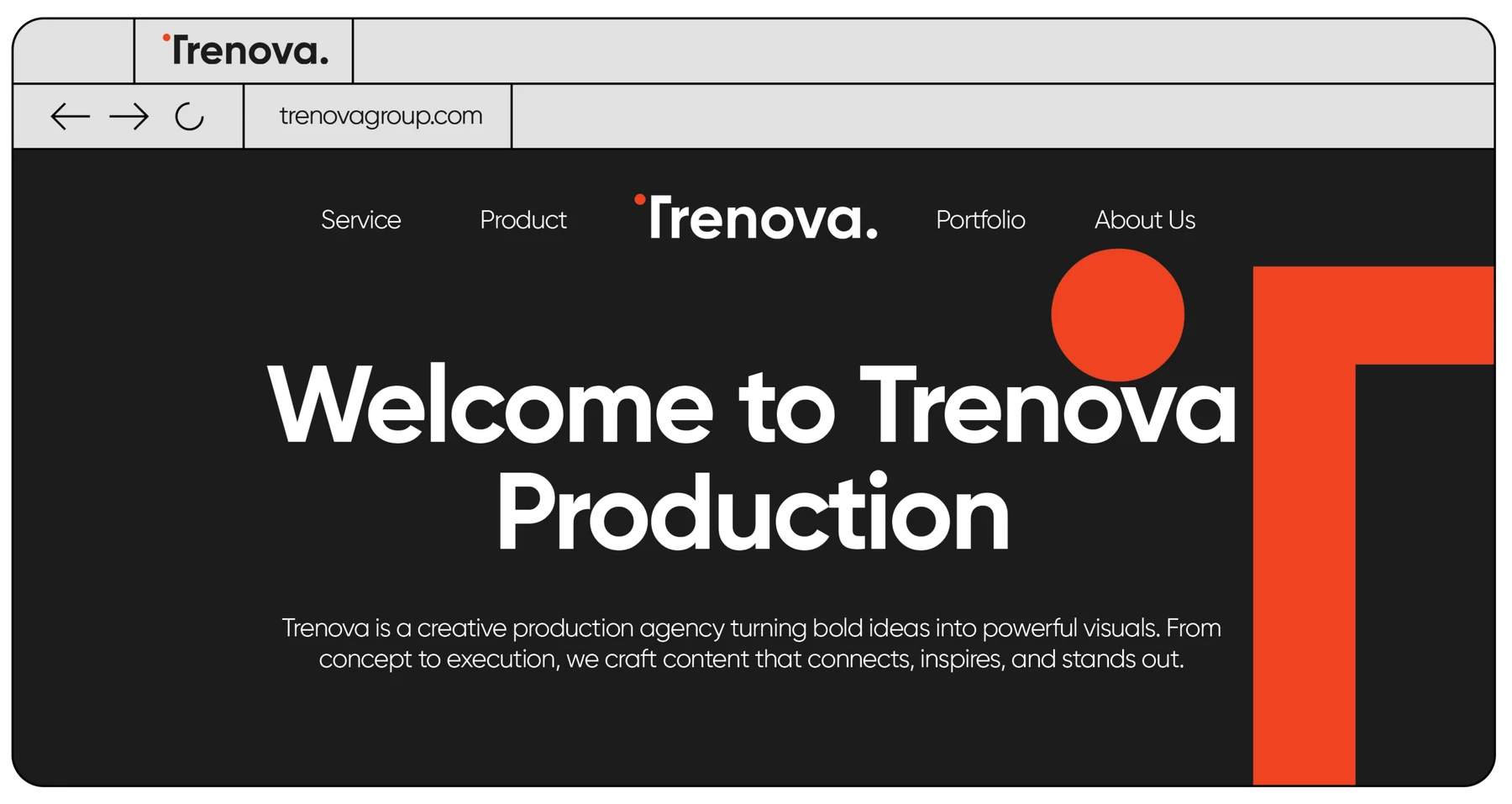
The brand’s digital front door — a dark, editorial web interface where large white typography meets the orange geometric T, translating the identity to the screen.
The Challenge
Carry the print identity onto the web without losing its weight: the same grid discipline, the same contrast, at every viewport size.
Creative Direction
A charcoal canvas, a single commanding headline, and the geometric T anchoring the composition to the right — navigation reduced to the essentials.
The Result
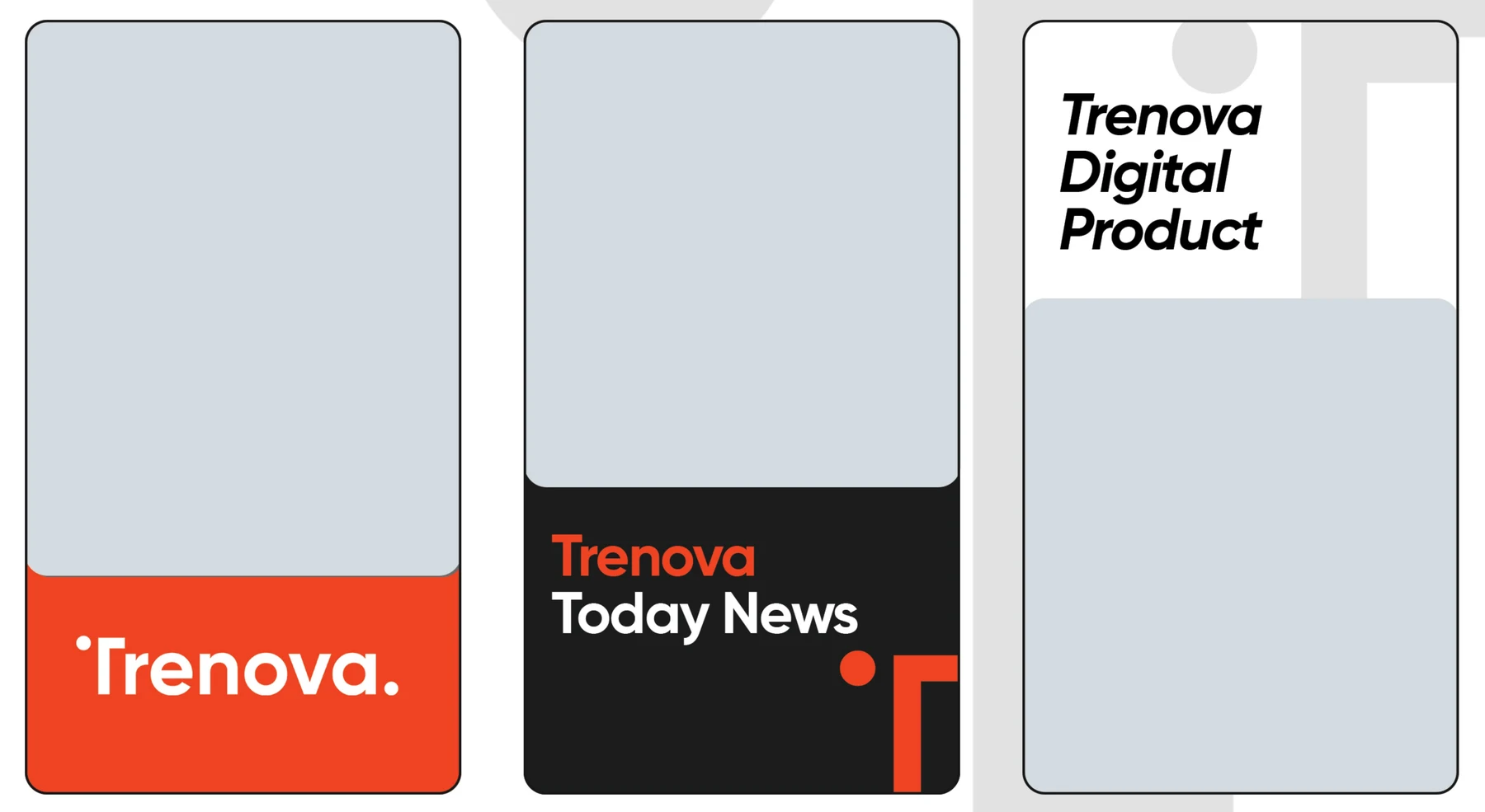
A digital presence that feels engineered from the same material as the brand book — bold ideas, powerful visuals, no compromise.
Let’s makesome content.
Your story deserves more than just content. It deserves cinematic identity.
Start a Project
Reach out. Let’s create something unforgettable.